
Velora — Brand Identity & Logo
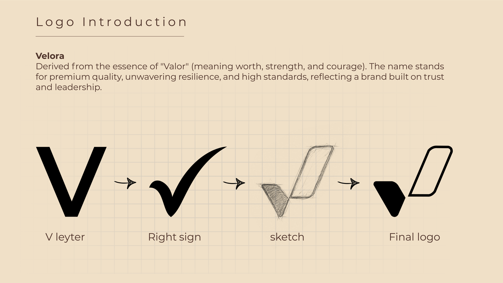
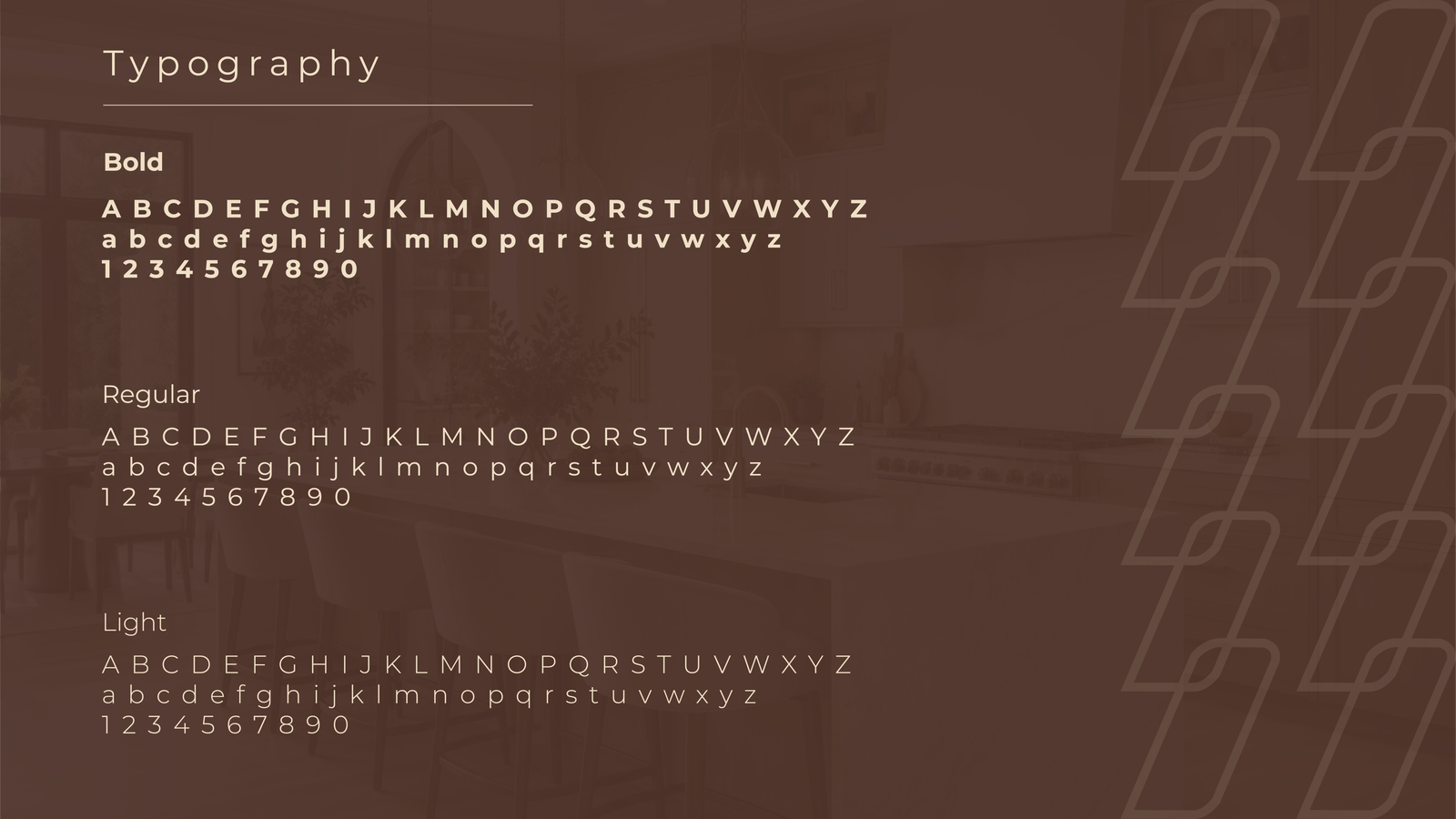
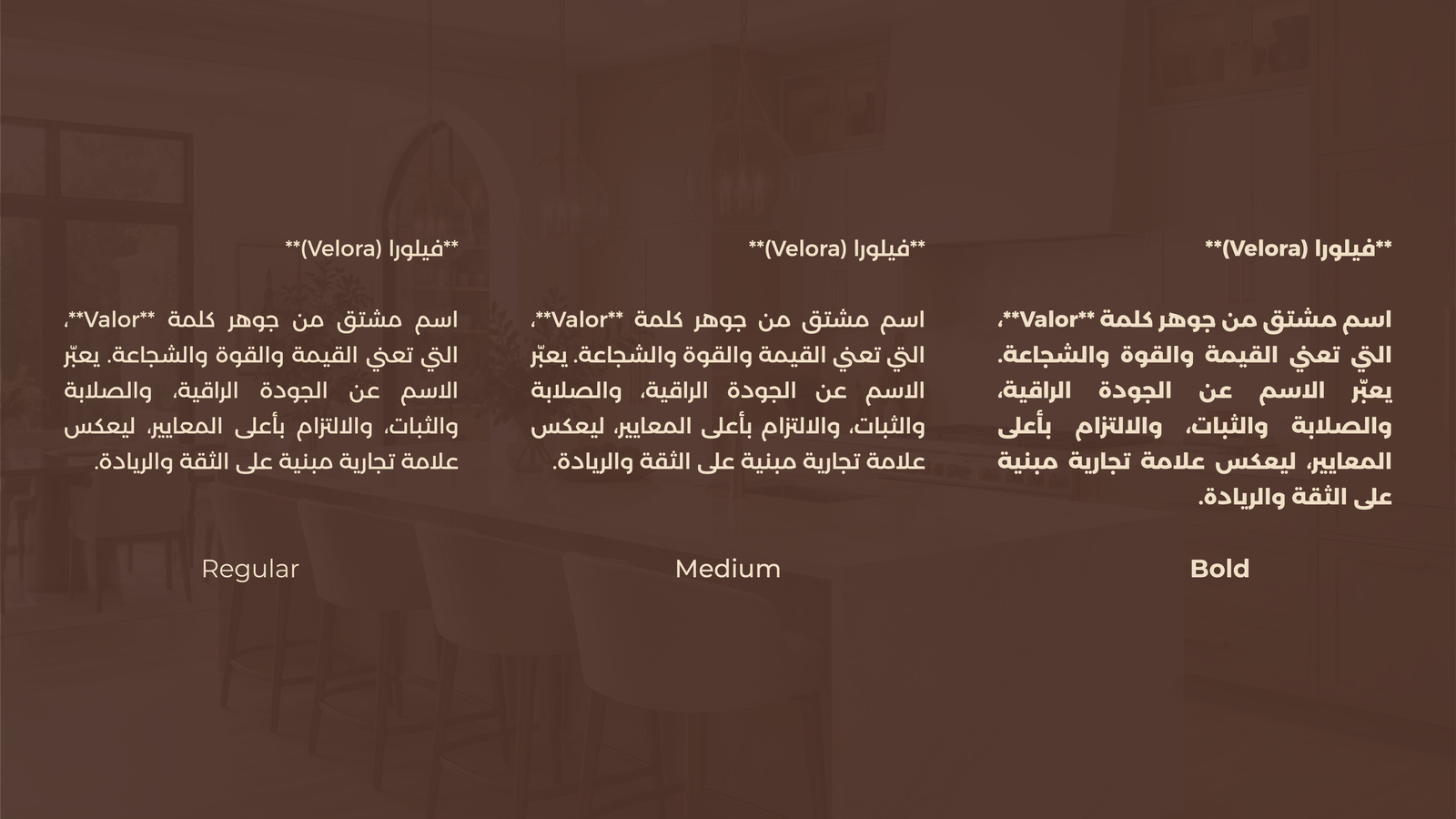
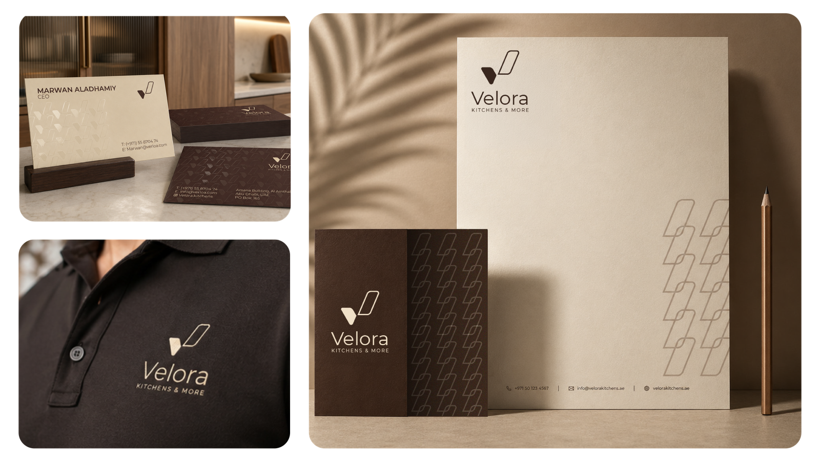
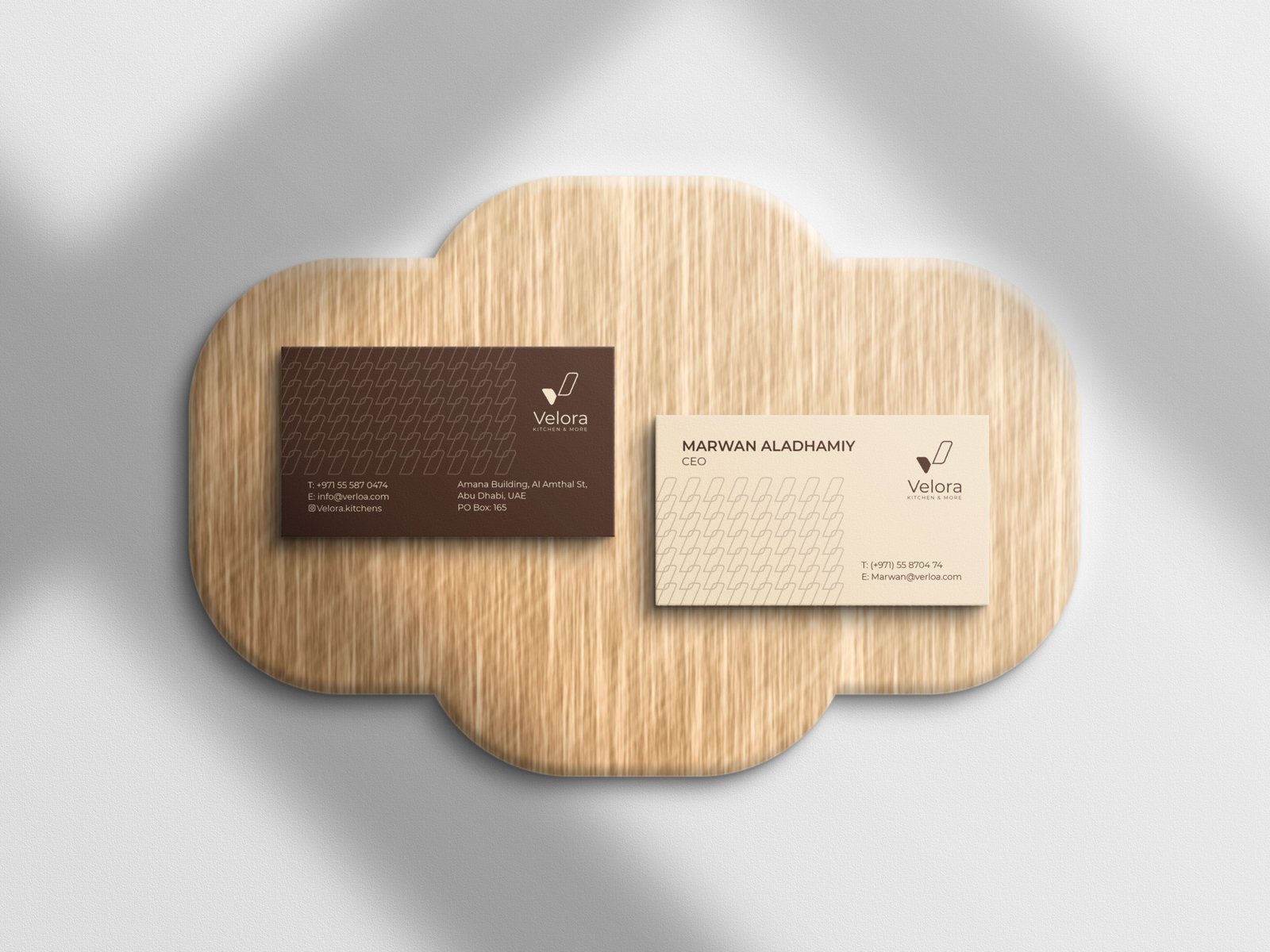
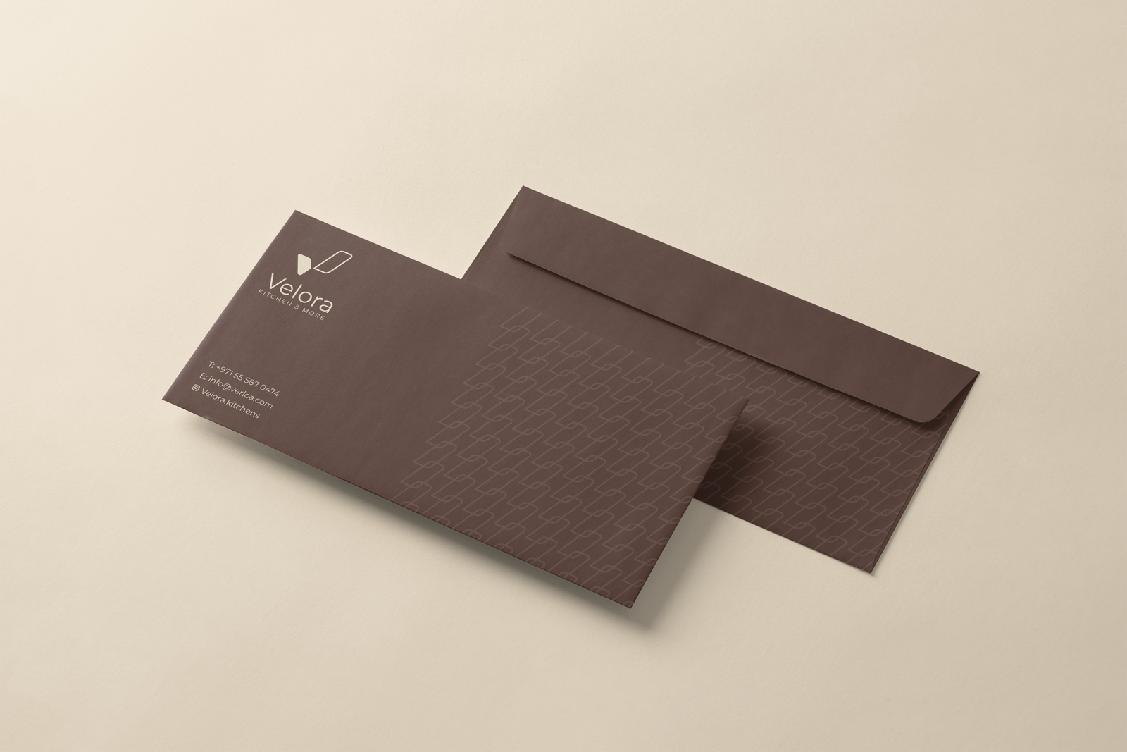
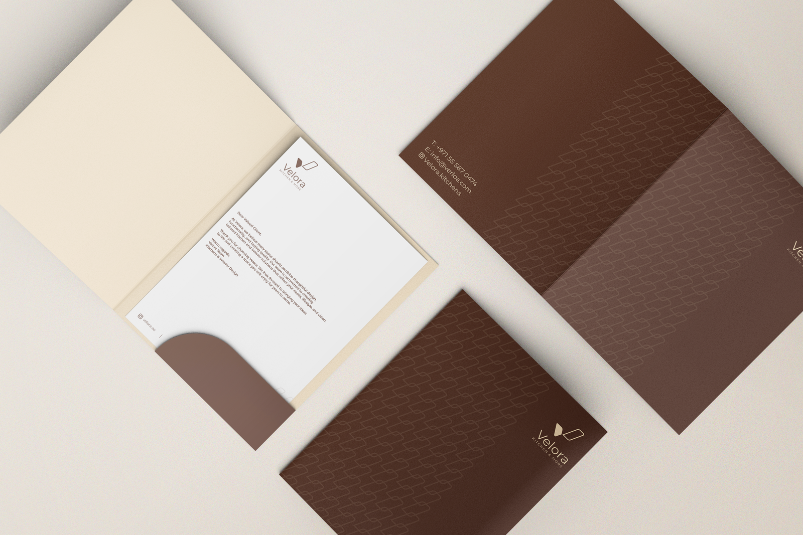
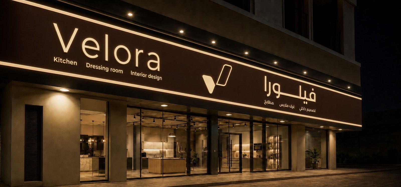
Brand identity and logo design for Velora, inspired by the idea of "Valor".

MORE IN Branding & Visual Identity
Related Selected Works
Bru Café — Brand Identity
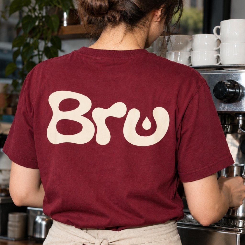
Bru is a café whose name is a playful take on “brew”, and the brand identity was built around that idea. The wordmark uses soft, fluid letterforms in a warm cream on deep coffee brown, so it feels rich, friendly and easy to remember. A small drop detail inside the letter “u” nods to the pour, tying the name, the shape of the logo and the coffee itself into one simple idea.